Dancing to the Tunes of a Choice Architect
Not so long ago, while I was booking a flight for a friend’s destination wedding, I noticed that the price quote on the final page of the airline website was $20 higher than my careful calculations done prior to the actual booking itself. Upon a closer examination of the breakdown, I noticed that I had been automatically signed up to make a charitable donation of $20 to an institution that is devoted to helping underprivileged children. While one could argue that the inherent altruist in me could not find it in herself to uncheck the box that provides care to an underprivileged child in need, I could not help but feel a tad bit uncomfortable that my decision had been made for me by clever choice architects who (correctly) relied on my apparent rush to get done with the purchase process, and poor attentive skills as a consequence of the same.
Put very simply, choice architecture follows the belief that decisions are not made in a vacuum, and offers a set of tools that help policymakers or marketers or anyone who dons the role of a choice architect with a set of handy tools to tweak a decision-making environment in a manner that aims to influence the final outcome. Behavioral economists (particularly Richard Thaler and Cass Sunstein) describe the decision-making environment as one where the devil is in the details, and where even the tiniest aspects can have a major impact on behavior. They add that a good choice architect is one who realizes “that although they can’t build the perfect building, they can make some design choices that will have beneficial effects”.
Although at first glance the theoretical foundation and the rationale behind the existence of choice architecture seems rather intuitive, this article will serve to highlight how entrenched it is in our daily lives, and, more importantly, how its existence and its attempted influence on our behavior often goes unnoticed. Given the sheer breadth of information humans encounter on a daily basis, it is no surprise that little details often escape us. However, what should be of particular interest, and (sometimes) concern, to us is when the details are deliberately designed to escape us, or to prey on certain biases we are bound to fall victim to.
For instance, let us consider the example of subscription messages often encountered while making online purchases, or browsing through your run-of-the-mill content-centric website. Upon a closer look at the framing of these messages, one can discover that some types of messages are designed specifically to elicit a ‘yes’ out of the customer.

An opt-out frame is one where the default option (one that kicks into action if the decision maker does not make an explicit choice) is enrollment or consent. If success were to be defined as the degree to which a given frame achieves enrollment, the opt-out is indeed most successful because it benefits from the existence of a bias we humans often unknowingly subscribe to, status quo bias. For choice architects, this bias for the status quo over the alternative choice roughly translates to a simple rule: default options tend to stick. This seemingly theoretical rule is also supported by the numbers. For instance, in a seminal study, Madrian and Shea (2001) studied the outcomes of companies altering their 401(k) choice frames for new employees from a non-enrollment default to an enrollment default. It was discovered that very few employees in the automatic enrollment scheme (opt-out frame) selected out of their 401(k) plans, generating participation rates that approached 100% in many companies. Therefore, if numbers are the primary concern, opt-out is probably the way to go. However, this frame is not free of significant downsides, downsides that that often make choice architects wary of employing the opt-out. While it is less of a concern with seemingly harmless subscription messages, opt-out frames come under scrutiny when employed in domains that have a more significant bearing on an individual’s life (for instance, organ donation), leading to moral and ethical consequences that often obstruct its employment.
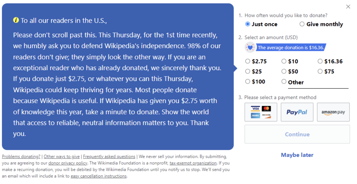
In looking at the more ethically acceptable tools of choice architecture, the opt-in frame features as an example of one frame that is often used by architects. Viewed as the opposite of the opt-out frame, non-enrollment or no consent is the default option in this case. An example of the same can be seen in Wikipedia’s periodical plea for donation illustrated in Figure 2 below. As seen in the figure, the default option here is to skip donating by scrolling through the page to access content as planned or to close the window by clicking the ‘x’ button on the top right corner.

Figure 2. Typical Wiki Ad (2021)
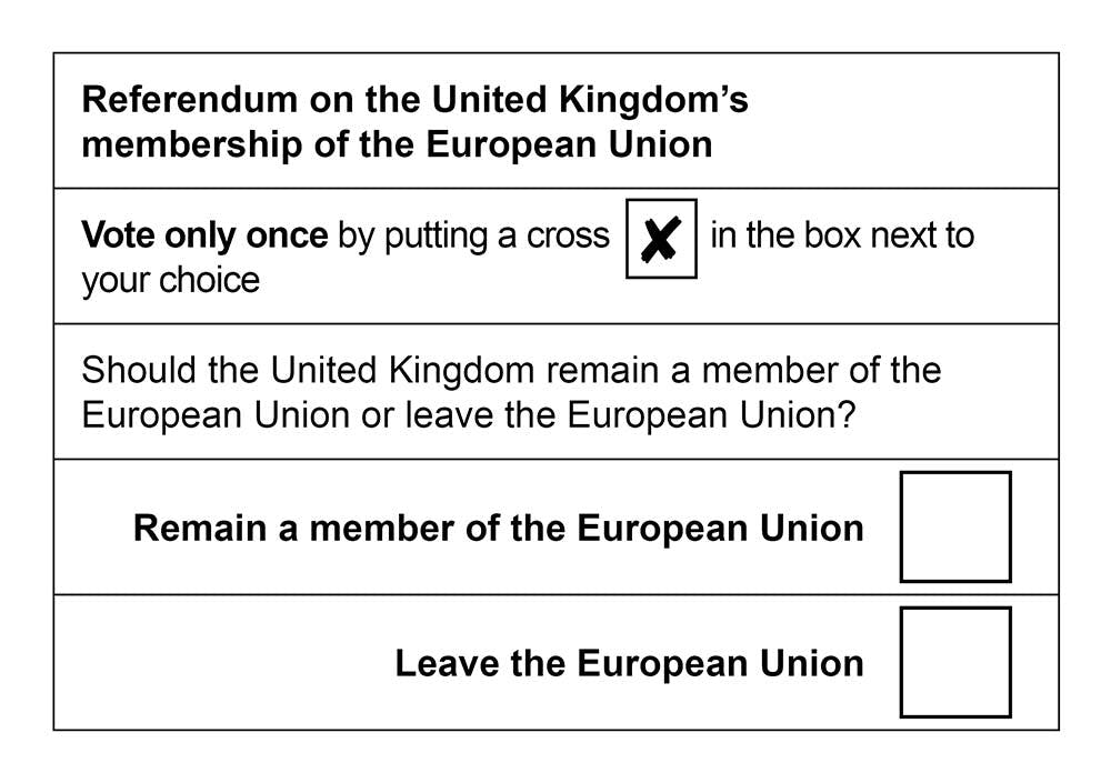
While it is true that inaction here would lead to no consent (or, in this case, no donation), what is of particular interest is that there is a lack of an explicit ‘no’ option. Would framing the choice differently by adding a ‘No, I do not want to donate’ have an impact on the aggregate amount donated by inducing a feeling of guilt in the minds of a reader? This third frame within choice architecture, known as the active choice frame, examines decisions in environments where there is no default option, or where neutral framing is at play. A recent example of the same can be seen in the Brexit referendum (Figure 3). As seen below, the choice is framed in a manner where there is no implicit default and the framing is strictly neutral without an attempt to influence the vote in one direction over another.

Figure 3. The Electoral Commission, Public domain, via Wikimedia Commons
In comparing and contrasting an opt-in frame to an active choice, the latter usually finds more success in garnering consent in domains that include volunteering, saving for retirement, HIV testing, pro-environment behavior, and decisions regarding one’s health. For instance, a study by Keller, Harlam, Loewenstein and Volpp (2011) demonstrated that active choice is more effective than an opt-in when it comes to deciding whether to get a flu shot. While 69% of the respondents indicated that they would get a flu shot in the active choice frame, only 42% did so in the opt-in frame. A second study (Cioffi and Garner, 1996) that looked at volunteering decisions for a sex and AIDS awareness education project adds to the literature on the success of an active choice frame by suggesting that active choosing results in a greater degree of commitment to a given activity as compared to making the same decision passively. Thus overall, this frame is desirable for some choice architects because it kills two birds with one stone, in that it both circumvents ethical issues tied to an opt-out frame and yields more beneficial outcomes as compared to opt-in.
Behavioral Science, Democratized
We make 35,000 decisions each day, often in environments that aren’t conducive to making sound choices.
At TDL, we work with organizations in the public and private sectors—from new startups, to governments, to established players like the Gates Foundation—to debias decision-making and create better outcomes for everyone.
The AI Governance Challenge
However, the story does not end here. Some choice architects move one step beyond the active choice frame to one that is becoming increasingly popular – enhanced active choice. Funny or Die’s subscription message, shown in Figure 4 below, is a neat (and rather funny) example of this frame. While the existence of an explicit ‘no’ option makes this an active choice, the framing of the choice is anything but neutral. The clear dominance of the message to enroll, or the mocking nature of the decision to avoid enrolling, enhances the enrollment frame making this an example of an enhanced active choice. The success of this frame is also supported by the academic literature on the topic. For instance, in the previously mentioned study that looks at the decision to get a flu shot (Keller et al. 2011), the enhanced active choice frame yields significantly higher rates of compliance as compared to the active choice since it highlights key advantages and disadvantages of the alternatives, making this frame yet another tool desirable to a choice architect.
Awareness, awareness, and more awareness
Now that we have gone over the essentials of choice architecture, what is to be done with this information? While the domains described above are not of great consequence to the reader, the key takeaway here is that awareness is crucial to avoid falling prey to the shrewd tactics of marketers who use a combination of the techniques above to squeeze consent from an often-unwilling customer. For instance, it is safe to assume that no one is a fan of spam mail. But more often than not, we find our inboxes flooded by junk email from companies and websites we once paid a visit to. A small step towards eliminating the annoyance caused by spam is to simply be aware. Whether you encounter a pre-selected box or a frame where there is no pre-selection, a quick look at the accompanying statement will help you identify what kind of choice you are expected to make, and if you personally see a moral or ethical consequence attached to a particular choice. At most, it would add one minute to your shopping or browsing process, but ignoring this could lead to months of consistent spam.
So, the next time you are buying stationery items from your local online retailer, be aware that they are going to want you to subscribe and that they are going to nudge you towards a ‘yes’. While you may still unknowingly fall for it or willingly go ahead, spending that extra minute to be aware of this tiny yet crucial detail within your decision-making environment will leave you muttering ‘I see what you did there’ rather smugly to yourself!
About the Author
Poorvi Iyer
Poorvi is currently pursuing an MSc in Social Research Methods at the London School of Economics and Political Science. Prior to this, she has completed her BA in Economics and Psychology from New York University (NYU) and an MSc in Economics and Business (with a


